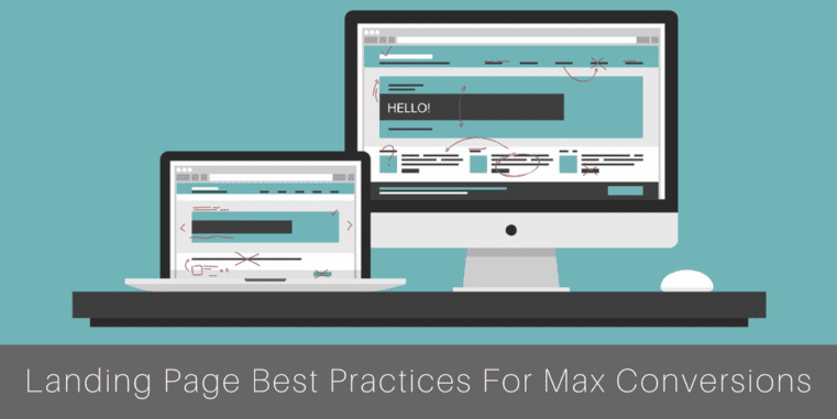
A landing page is more than just creating text and slapping it on the internet.
In fact, the gurus of internet marketing know a thing or two about creating stellar landing pages that drive maximum conversions.
If you have not seen much from your landing page, it might not be the product or service you are selling; instead, it is most likely how you present it. Luckily, presentation errors are the easiest thing to fix in online marketing – and it will only take you a day to do it.
By following these steps and implementing as much as you can into your new, revamped landing page, you will surely see improvement and get more conversions.
First, Avoid the Flaws
Do you know the common flaws that kill a landing page’s performance?
Your landing page is there to help you acquire valuable information, get someone to sign up, or even get them to call in and start ordering.
So, with so much at stake, you cannot risk having easily fixed errors dragging down your conversion rates.
3 Top Flaws to Fix on Your Landing Page Now
-
You’re Crunching in Too Much Info
Landing pages should be easy to read, regardless of whether they are 1,000 words or 3,000 words.
It is a big turnoff when visitors have too much information to absorb.
Instead, you must only give them what is needed to get them to convert. The nitty gritty details can come later.
-
No Call to Action
Yes, your call to action matters.
If you sell it perfectly but don’t give the visitor any direction as to where to go next, they will not take any action.
Keep it simple and have a landing page with one very specific call to action (i.e. sign up, click to purchase, and more). Avoid multiple offers, too. KISSmetrics points out that 266 percent fewer leads generate from multiple-offer landing pages.
-
No Photographs
A wall of text is not going to get you anywhere with today’s reader.
Instead, you need to break up the text, make it flow, but also add some photographs. People are visual, so if they can see the product or service in action and absorb visual along with text content, they are more likely to convert.
Keep It Short, Simple, and Easy to Read
Your content must be readable.
After all, reading from the screen is not easy for some. However, if you can boost the readability, target the right group, and send a clear message, you will see the many conversions follow.
5 Tips for Maximum Readability
-
Include Only Clear Paragraphs:
Paragraphs must be clear. Your most important sentence, the one that draws the reader into your page and makes them keep going is what belongs at the top. Break up your paragraphs and transition into meatier ones later.
-
Use Short Sentences:
No more than 20 words per sentence. The longer the sentence, the more likely you will have grammatical errors, and the reader could lose interest.
-
Omit Difficult Words:
Yes, you want to sound authoritative, but throwing out difficult words makes it harder for the reader to relate to your product or pitch.
-
Embrace Transitional Words:
Transitional words help sentences and ideas flow together smoothly. These include phrases like “most important,” “thus,” and “therefore”.
-
Vary the Text:
Add variations to your text and make sure you are not utilizing the same words over and over.
Dissecting the Anatomy of a Perfectly Created Landing Page
To design the perfect landing page, you must first know what the anatomy of one would look like.
7 Components of a Well-Crafted Landing Page
-
Getting to the Point
People should not have to read below the fold to figure out what the purpose is of your landing page. In fact, if they must wait that long, they are not going to see it.
You can get to the point more quickly by using easy-to-read bullet points, italics, bolds, headers, sub-headers, and more.
-
Embrace Contrasting Colors
A call to action should have a color that pops from the landing page. This encourages your readers to take the next steps. Using contrasting colors will surely get their attention and make sure they read (and do) the CTA.
-
Brand, Brand, Brand
Your brand should be at the top of your mind when creating these offers and landing pages. People should recognize the logo, your brand’s language should be consistent in the message, and visitors should instantly know which company is on that page.
-
Avoid Annoying Clutter
No one wants to be bombarded with too many photos, sounds, and videos popping up on the landing page. Also, the more clutter you have, the slower the landing page loads, which means a higher bounce rate for you.
-
Embrace the Power of Formatting
From bullet points to laying out everything in a clear, well-structured manner, there are ways you can make your landing page’s content easier to read – and it all comes down to formatting.
-
Add Your Social Supporters
While you could always add a case study or recommendation from a traditional party, adding social proof to your landing pages is effective, too. These are the comments and testimonials you have on Facebook, Twitter and more. Sharing these insightful words can motivate a visitor to act.
For example, you could highlight how many social media users have taken advantage, and then share some of their social media comments below.
-
Always be Consistent
The landing page format you use for one product or service should be similar to all the others. You want a cohesive run from landing page to website content, and when you stay consistent, readers will be able to navigate your site more easily, too.
At Thrive, We Know Landing Pages
The internet marketing team at Thrive knows how to create not only killer copy but stellar landing pages that drive conversions.
If you find your landing pages are not meeting the mark or you are just struggling to come up with a clear image, let us help.
Our team can handle everything from building your web presence to managing marketing and even helping you set up your social media.
You can contact us online to schedule a free consultation or call us at 866-908-4748 to learn more about our services.
